I once told myself: IF I am accepted into grad school, this blog would no longer be updated. As it turns out, in April, I received news of my acceptance for the Fall 2013 semester, where I will attain a Master's degree of Science in Nutrition.
Running a blog, as many of you may already know, is a demanding side job once the excitement wears off. And once I fell out of the blogging community's loop (have you SEEN how many blogs there are now? Wow!), it was like the kiss of death. Despite my best efforts, I couldn't get into a blogging routine once this happened due to the disconnect I felt from the community.
So I took a break. I struggled with the loss and with missing my blog. And then I realized I didn't have to run Book Faery to still be a book reviewer; I could read my books and post reviews online. I'm still a book review blogger, just not in the traditional sense.
I'll still be online. You can chat with me on Twitter, where I'll be posting links to my reviews and talking books. I'll also be posting links to nutrition articles. And if you'd like to connect with me where I guarantee I will post reviews, just add me as a friend on Goodreads.
So that's all, folks! It's been a fun and amazing journey, and I thank you all for listening to my thoughts about books. I hope we all can keep in touch elsewhere :)
Tori

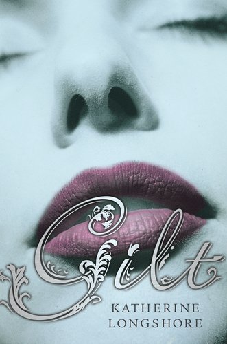


Hmm. While I think the content for Gilt is more interesting, I don't like the way you look up the cover model's nostrils. Sort of like the black holes of now return. So I'll go with Cold Kiss. Overall, I think it looks a bit more professionally done.
ReplyDeleteRenae @ Respiring Thoughts
This one's tough... I love the font for both, but I think GILT's font is more attractive. As for the cover model, I prefer COLD KISS over GILT, just because her face is less distracting and I like the frosted effect. Plus, the colors work well together.
ReplyDeleteIf my vote was going just by font, GILT would win.
Since this is the cover in its entirety, I'd have to say COLD KISS. It's more telling.
Cold Kiss for me. I don't like seeing up people's nostrils xD
ReplyDeleteCold Kiss please, I don't like looking into noses.
ReplyDeleteI agree with Tori and want to add that I would like to know what lipstick the Gilt model is wearing! But overall composition? COLD KISS, hands down.
ReplyDeleteI really like the font for Gilt as well but I can't get over looking up her nose. So I vote for Cold Kiss..
ReplyDeleteI can see why the nostrils might not be popular, but to me, the font's more important. In addition, I like seeing more of the face. The lips on GILT look more realistic - and yes, like jessicacorra, I love that lipstick! So my vote's for GILT.
ReplyDeleteMy name is Beth, by the way - I don't know why it didn't give my information when I commented. Just want to make sure my vote counts!
DeleteMy vote is for GILT. The font is fabulous!
ReplyDeleteSjoe this is very hard! But I'll go for Gilt.
ReplyDeleteI vote for Cold Kiss - the 'faded' texture works here :)
ReplyDeleteI prefer COLD KISS. You can read the title better.
ReplyDelete