Hello and welcome to another installment of...
Cover Wars!
(inspired by Kate's Throwdown Thursday at The Neverending Shelf)
Cover Wars!
(inspired by Kate's Throwdown Thursday at The Neverending Shelf)
Note: My apologies for pushing this back to Tuesday. I had already scheduled a guest post way before Cover Wars! was in mind.
Last week (except it was more two weeks ago, but who's keeping track?) on Cover Wars, we had a face off between Shadow Hills by Anastasia Hopcus and The Dark Divine by Bree Despain.
The vote was unanimous. You all would prefer creepy zombie legs over a wisp of smoke.
Congrats to...
Congrats to...
The Dark Divine
Week 4:
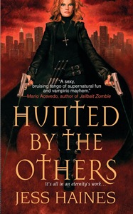
Hunted by the Others vs Taken by the Others
Hunted by the Others vs Taken by the Others
Both are written by the same author, Jess Haines.
Jess just revealed the new cover, TBTO on her blog, and I’m curious to see what you all think.
Personally, I think Shia is way too out of character on the Taken by the Others cover. I wish the art department had continued the badass Shia look that they adopted with the Hunted by the Others. But eh, that’s just my opinion. Either way, Taken by the Others is going to be amazing.
(I’m not sure if anybody actually likes the clothes Shia’s wearing in the second book. But if you do, please, speak your mind!) I will admit one thing about the second cover: I LOVE the purple tones. I think it makes the entire look vibrant and inviting.
Are you a fan of the original, with the badass, in character Shia? Or, are you smitten with the colors of the second book?
Which do you like more, and why?
Are you a fan of the original, with the badass, in character Shia? Or, are you smitten with the colors of the second book?
Which do you like more, and why?


I'm not a fan of either cover, but I definitely like Hunted better than Taken. I love the badass look and the red, red covers just work for me :-)
ReplyDeleteUh, they both seem to have pretty unattractive Barbie faces, it's rather odd o_o Plus, the second one kind of looks like she should be Conan's girlfriend, or something!
ReplyDeleteIf I *have* to pick one ... Taken ... she may have a man face, but it looks a little less plastic than the first one :o ... and I don't really like the flowing black coat on the first, it's too Matrix :o ... and the purple is gorgeous :D
The more I stare at them, the more convinced I am, lol ... no way is Hunted going to take Taken down!!
While the purple background in TBTO may be pretty awesome, there's no way that slutty outfit and weird-looking face can beat HBTO. Plus, I really hate it when book covers put characters in clothes that they would never actually wear!
ReplyDeleteCade
I don't really like either cover though if I had to pick it would be the red cover.
ReplyDeleteI'm not really a big fan of either cover either, but I prefer the first one, because on the second she just looks like a prostitute with a sword. Unless I'm missing something and between the first and second books, she becomes a prostitute that carries a sword, in which case, it's perfect.
ReplyDeleteI never really liked the Hunted cover however I prefer it to Taken. I'm not feeling the change in the character style and the purple isn't grabbing my attention much either.
ReplyDeleteDefinitely the first cover better. I hope that's not the final cover for the sequel because those clothes just make her body look awkward!
ReplyDeleteI have to say Hunted. I like how the text appears to be coming out of her jacket.
ReplyDeleteMelissa
I like the first cover better.
ReplyDeleteMy comment will be harsh but Shia on the second cover just looks like a photoshop experiment gone bad.
I love the purple theme, in fact I love everythng for the second cover except for Shia herself. Her cloths don't fit her, and her face is way to masculine + the neck line is just obvious photoshop.
I'm sure the second book will be amazing so the cover won't stop me from buying it, but a new reader might be stopped by it.
I realy hope they change it before the release.
Both covers are kind of freaky but if I had to choose I'd say the purple one because it looks less demonic.
ReplyDeleteI do not like the Taken cover - I agree with Tynga - she doesn't look quite right (body wise)
ReplyDeleteI like the hunted cover better. The other was kinda cheesy looking to me. I don't ever judge a book by its cover though...I read the reviews and then give it a shot.
ReplyDelete